CLIENT
Fern Vitality
YEAR
2021
MY ROLE
Brand Design
Visual Identity
Art Direction
Packaging Design
Social Design
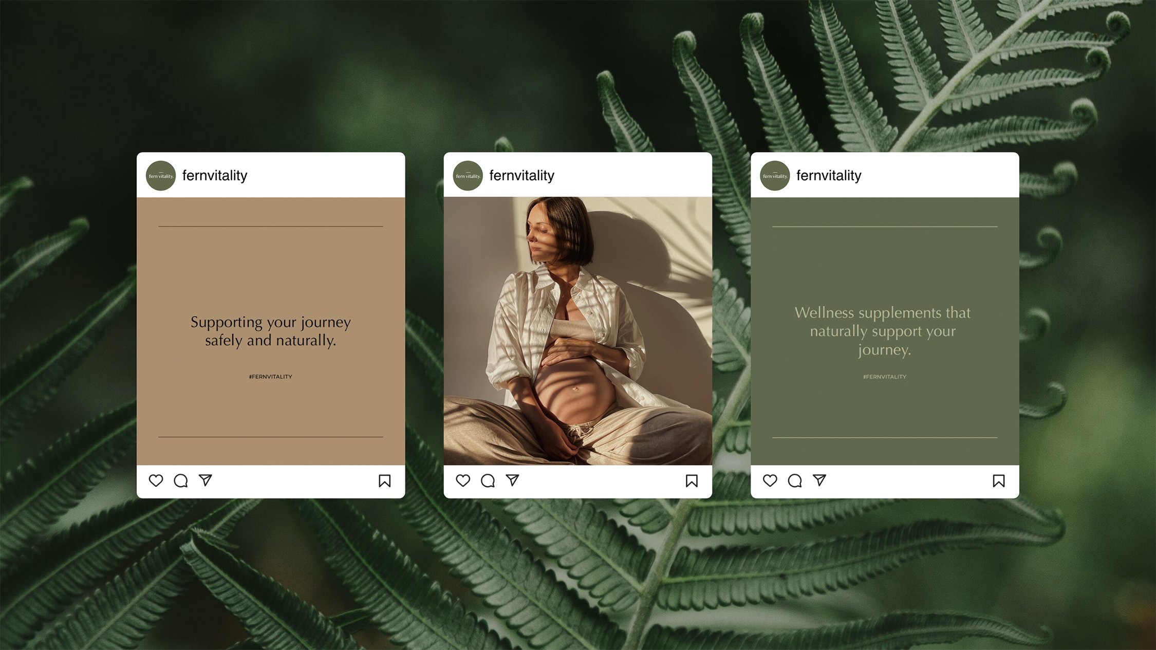
Wellness supplements that naturally support your journey.
Fern Vitality arose after the founder's personal struggles with nausea during pregnancy and the lack of natural solutions available in the market. Competitors seemed to convey a dismissive tone towards their audience, treating the problem as an inconvenience rather than a significant issue that deserved a viable solution.
The brand name "Fern Vitality" was thoughtfully chosen, being reminiscent of the founder's New Zealand heritage and a name that resonated with her. In seeking a brand identity, Fern Vitality aspired to reflect the same level of comfort and support found in their natural nausea relief.
Fern Vitality is a women-centred wellness brand that offers safe, effective and natural solutions for women during pregnancy and beyond birth.
VISUAL IDENTITY
Creating the brand.
The brand identity is a modern retelling of motherhood, plain and simple. This is for the women that don’t want to lose themselves during pregnancy.
The Fern Vitality logo uses Optima, a humanist sans that feels elevated, yet familiar. The bar above the logo balances the logo and offers a sense of calmness and elegance. I wanted the logo to feel premium and special to give the audience a sense of luxury in their day to day.
The logo is paired with humble typography and a gender–neutral grounding palette to represent the science-based, human-led approach of Fern Vitality. The colour palette is inspired by Fern Vitality’s origins of nature and earthy hues to ensure a soft, nurturing aesthetic that isn’t too clinical or sterile. Linework has been used to give the identity a graphic layout that is modular and clean, giving the brand a more scientific look.

PACKAGING DESIGN
Wrapped with care.
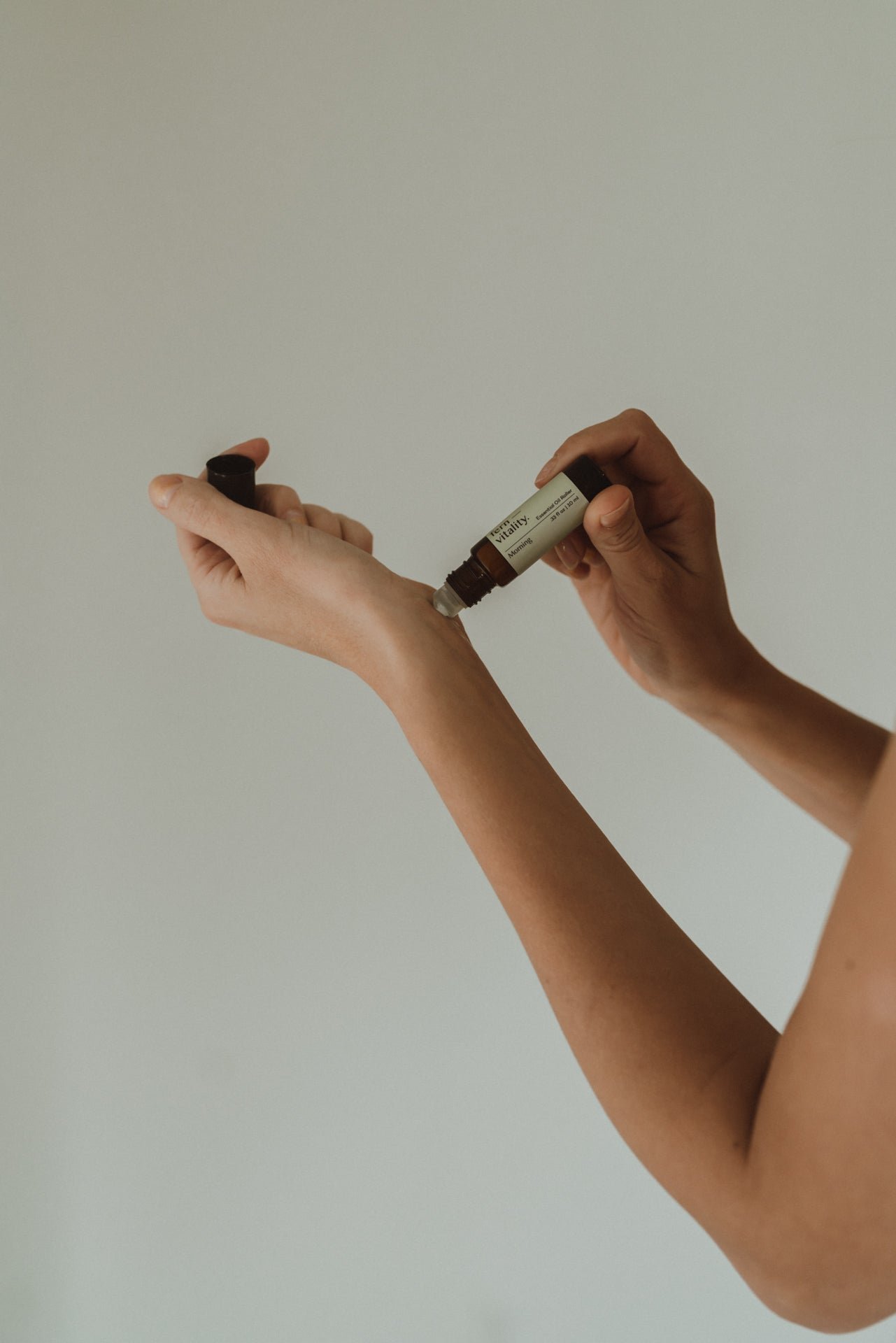
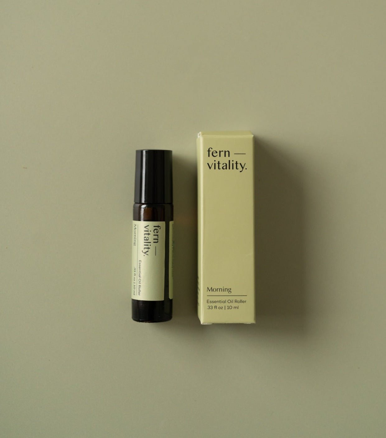
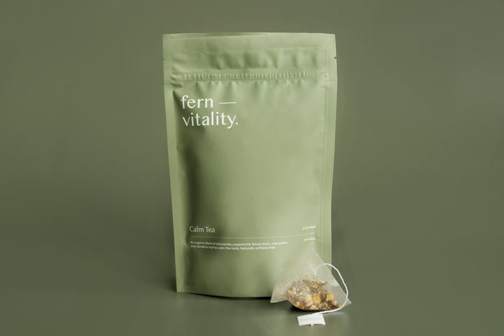
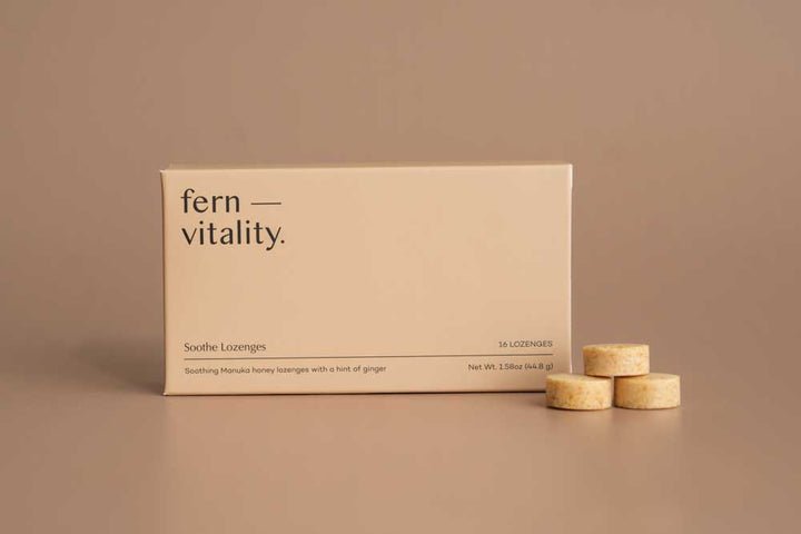
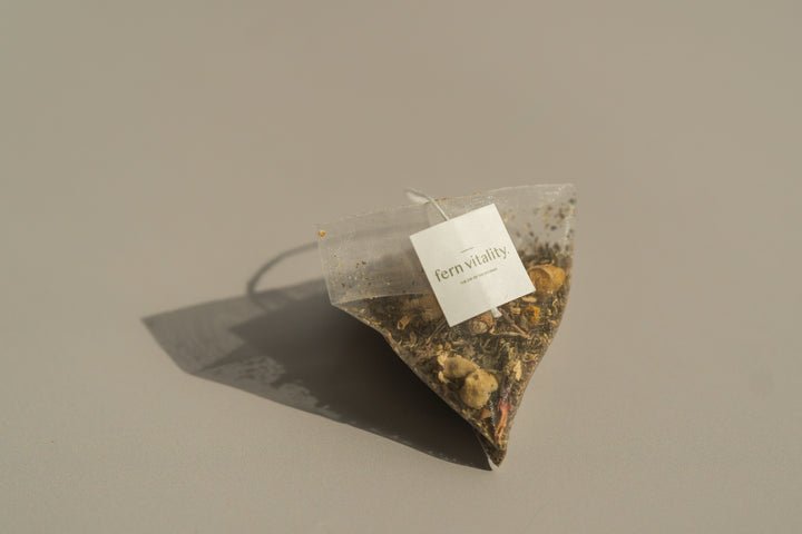
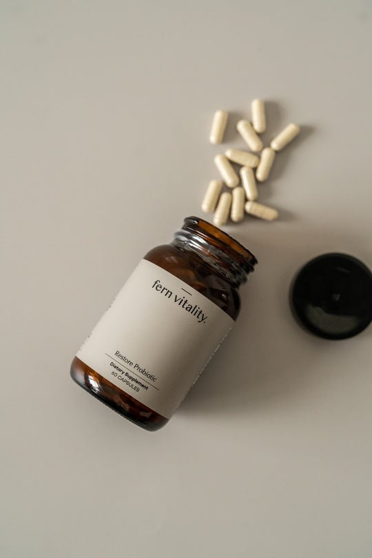
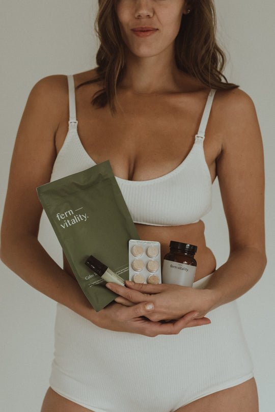
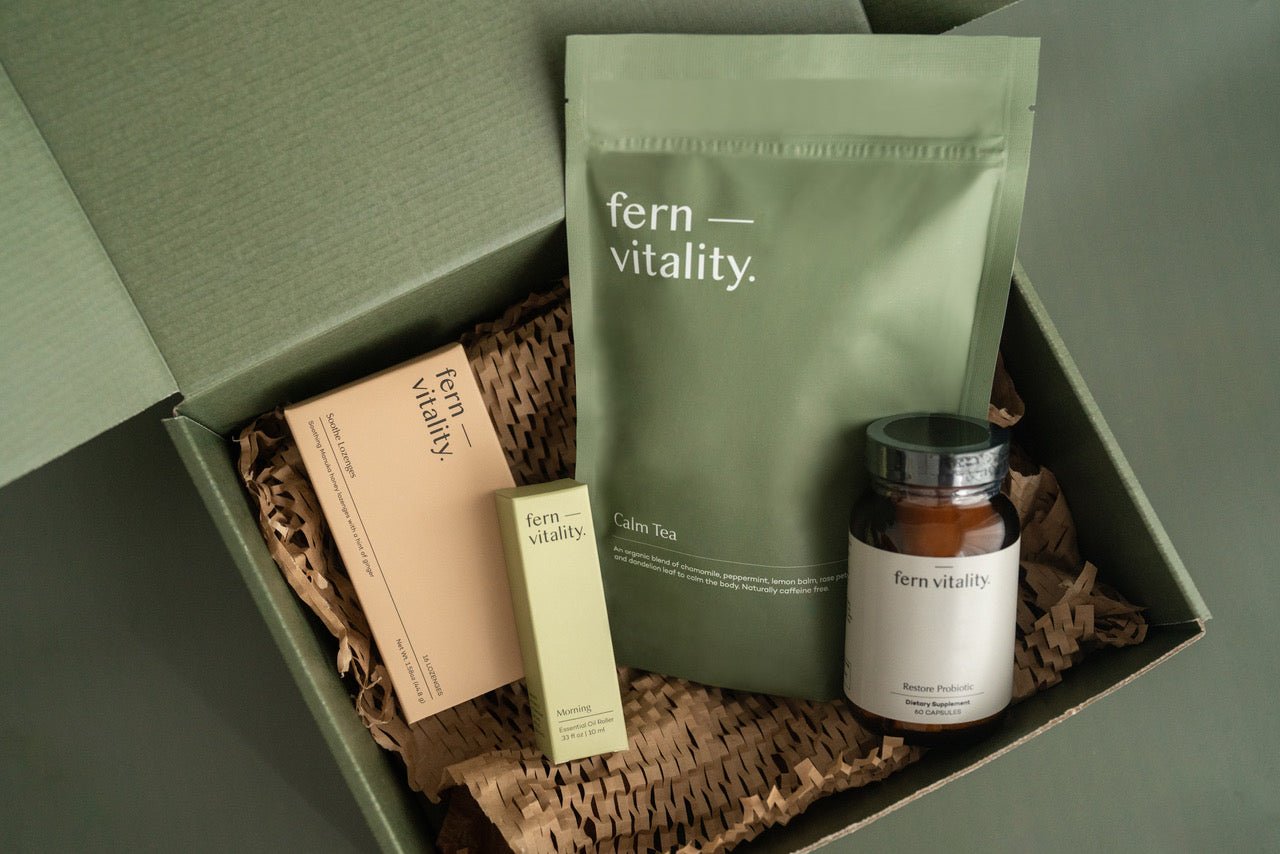
Fern Vitality's packaging design is a reflection of their commitment to providing natural nausea relief products that are not only effective but also visually appealing. Each product boasts a unique look, represented by a carefully selected colour from their earthy brand colour palette. I used block colours and a linework structure to create clean, minimal packaging that exudes a premium and expensive feel.
The design philosophy centers around blending earthy colours, a sophisticated design structure, and an intuitive and encouraging tone of voice. This approach results in a calming and memorable brand experience that conveys the love and care Fern Vitality put into each product. Using this thoughtful attention to detail, I hoped to create a truly special experience for the customers that resonates with them long after they've tried the natural nausea relief products.
